Best font for resume: Sizes, styles, and margins
Picking the best font for a resume is more important than you might think. To make the right impression on the recruiter, it not only has to be easy to read, but it should also convey a professional tone. This article will show you how to choose the right font, with examples.

The font you choose for your resume does more than make it easy for recruiters to read your application – it also tells them a story about who you are as a candidate. Make the wrong decision, and you could ruin your chances of success before you've even started. So, how can you make sure you're using the best resume fonts for your needs?
This article will cover:
- Which fonts are both ATS- and reader-friendly
- How to choose an industry-appropriate font for resumes
- The right text size for resumes
- How to select resume font combinations, line spacing, and margins
With this advice, you’ll be able to create a resume that makes an excellent first impression and increases your chances of getting the interview.
Best resume fonts
According to Jobseeker's hiring study, 59% of recruiters prefer classic fonts like Times New Roman or Calibri. But what other fonts can you use? Here is a selection of some of the best resume fonts that are easy to read and professional.
Arial | Arial is a highly recognizable and widely used sans-serif font included in many word processors. Hiring managers love its clean, modern, easy-to-read text. |
Helvetica | Helvetica, used on U.S. tax forms, is a sans-serif typeface known for clean lines and neutral design. Many herald its legibility and compact look. |
Calibri | Calibri is a humanist sans-serif font inspired by ancient handwriting. It features rounded stems and corners that make it warm, soft, and highly readable. |
Garamond | Garamond is an old-style serif that mimics handwritten pen strokes. It’s a popular choice for print and can add character and style to a resume. |
Times New Roman | Many choose Times New Roman for academic papers and reports because of its excellent legibility. The serifs create small decorative lines at the end of each stroke and maximize contrast. |
Georgia | Georgia is a serif typeface that features a large x-height (which makes the text appear larger) and a wide stance. These features make it highly legible, even at small sizes. |
Cambria | This transitional serif font was created specifically for the screen. Its short serifs, even spacing, and diagonal strokes make the font interesting yet easy to read at small sizes. |
Verdana | Verdana is a sans-serif font. Like Georgia, it has a large x-height and wide proportions and spacing, which contribute to its readability. |
Trebuchet MS | This humanist sans-serif font was also designed to maximize on-screen readability. It features clean lines and narrow letters, making it a good option for compact resumes. |
You might want to try out different fonts for your resume until you find the right balance of readability and style. The Jobseeker resume builder makes it easy to swap fonts without needing to reformat the whole page. With plenty of resume templates to choose from, you can quickly try out different fonts and choose the one that’s right for your industry and role. Create a professional, ATS-friendly resume that you can download instantly.
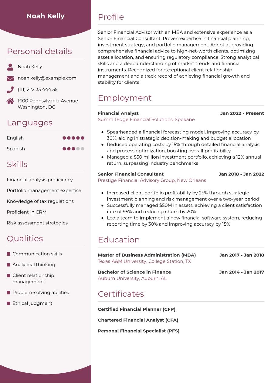
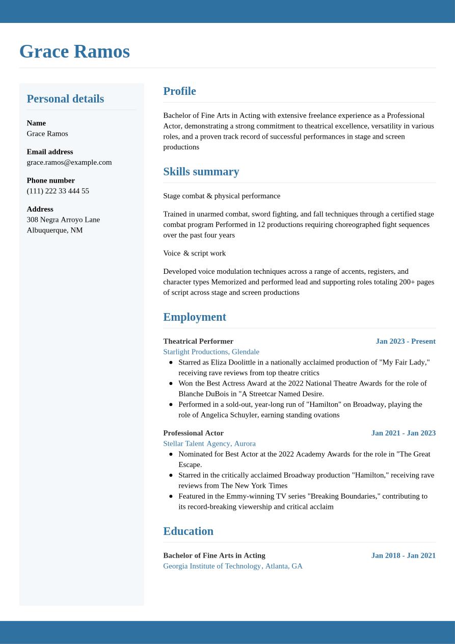
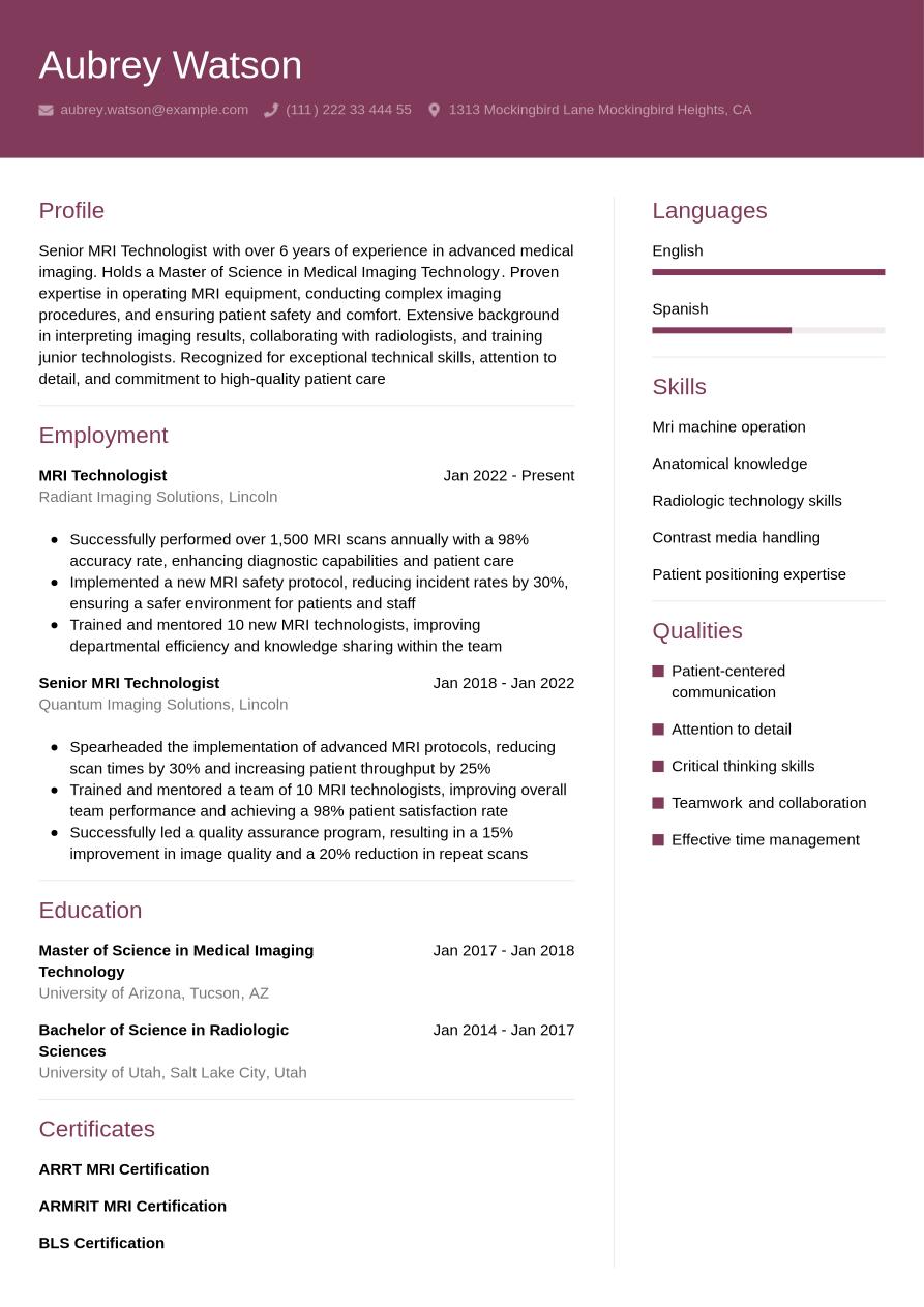
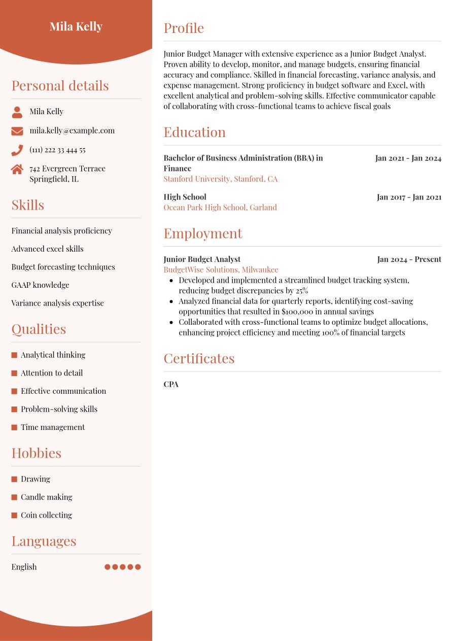
Here's an example of how different fonts look on your resume:
How to match your font to the industry
While we've covered some of the main fonts that are best for resumes, there's more nuance to this topic. You should also consider the industry you are applying for when you select your resume fonts. Different fields have different "norms" when it comes to the best resume fonts.
The recruiter that reviews your application will be familiar with the hiring standards of the industry. For that reason, there are certain fonts they will come to expect. Make sure the font you choose aligns with their expectations and positions you as a prime candidate in the field. Here's how:
Traditional fields
When applying to positions in fields like law, finance, or academia, there's one golden rule: it’s best to stick to neutral font choices. Don't try anything fancy or creative as it may work against you.
These sectors are highly conservative and value tradition, so you want to make sure your resume and other documents or resources come across as polished and professional.
Creative fields
If you are applying to a more creative field like graphic design, marketing, media, or advertising, it’s acceptable to branch out more with your resume fonts.
Your resume often works as not only a summary of your experience and qualifications but also as a visual representation of your creative skills.
Expert Tip
Remember: Readability is your number one priority. Going for a creative font? Make sure it's legible. The recruiter needs to be able to easily read your application to decide whether you're a prime candidate. If they can't read it, they might trash it.
Fonts to avoid for your resume
Certain fonts are not suitable for resumes and cover letters because they are too hard to read, take up too much space, or make your application seem unprofessional or unpolished. Here are four examples of fonts to avoid using on your resume.
Fonts to avoid on your resume:
- Courier: As a typewriter-style font, Courier not only looks outdated, but also takes up too much space on the page.
- Brush Script: Though Brush Script is highly decorative, it makes your resume hard to read and can come across as unprofessional.
- Papyrus: Papyrus is both cliché and outdated. It makes blocks of text very challenging to read.
- Impact: Impact is quite bold and heavy. This can distract from key information and be overwhelming for the reader.
- Comic Sans: Comic Sans is a more casual, handwritten sans-serif font. With its rounded edges, wide spacing, and irregular strokes, it often comes across as childish or unprofessional.
Resume font size, spacing, and margins
Should you use italics in a resume? And what size should your font be? It's one thing to get the style right, but the formatting matters, too. Getting the size, spacing, and margins on point is a must.
Resume font size
When choosing the best text size for resumes:
- Keep body text to the standard of 11 or 12 points
- Use a 14-point font size for names on a resume (as well as headings and subheadings)
- 10 points should be the smallest font size for resumes if you need to avoid spilling onto a second page
- Stick with sans-serif fonts if you use the minimum font size for resumes, as they will appear bigger and more readable
If you still can’t fit everything on one page, consider editing your content for brevity or adjusting the margins slightly rather than dropping the font size any further.
Resume line spacing
Some key considerations for line spacing for resumes include:
- Use one to 1.5-point resume spacing as a standard
- Reserve larger resume spacing for those with limited experience to help fill the page and prevent too much white space
- Use single spacing for experienced professionals who need to fit more on the page while preserving legibility
Note that 1.15-point line spacing for resumes is perhaps the easiest to read, providing some white space between lines while not egregiously using space.
Resume margins
Typically, resume margins are one inch all the way around. However, if you need to adjust the margins slightly to fit all of your content onto a single page, that is acceptable. Avoid making your margin size for resumes too small, though, or you run the risk that some of your text will be cut off when your resume is printed out.
Expert Tip
The same guidelines on font sizes and margins also apply to your cover letter. Make sure to match your resume and cover letter styling to create a cohesive look for your application. Our cover letter templates make this easy to achieve.
Resume font styling
Figuring out how to create a stylish resume without going overboard can be a daunting task. Here are a few tips to get you on the right track.
Resume font colors
The question of whether you should use colors on a resume is a tricky one. The standard resume font color, of course, is black. However, you can make the following adjustments while maintaining a professional look:
- Create visual interest by changing your header, headings, or subheadings to dark gray, navy, or forest green
- Change your body text to dark gray instead of traditional black
- Avoid garish colors that may create distractions and issues with readability
- Make sure your color scheme is consistent throughout the document
- Create a color-block background for your header (e.g., white text on a dark-colored background or black text on a light background)
- Use the same bold color from a color-block header background for your heading and subheadings, and leave the rest of the text black to avoid visual overwhelm
These tips will keep your resume legible and professional and ensure your style doesn’t take anything away from the content.
Using typographic emphasis
Should you use italics in a resume? Many people use typographic emphasis, such as capitalization, bold, and italics, in resumes with no problem.
These styles create some visual interest and help subheadings stand out, even when using the minimum font size for resumes. For example, you could use italics in resumes for supporting text, such as the city and state for each past position or where your university is located.
Expert Tip
As a general rule, bold and all-capitals can be used together, but italics should be used without any other emphasis - otherwise it can look cluttered. Steer clear of using underlines in your resume to keep it looking clean and organized.
Pairing resume fonts
When using two different fonts on your resume:
- Use two contrasting yet harmonious options
- Use one for your name and section headings, and another for the main content
- Try painting a sans-serif heading font with a serif body font or a more flowery script heading with a sans-serif body font
- Make sure both fonts are easy to read and go well together without pulling attention away from the content.
Additionally, make sure your cover letter font size and spacing are the same as your resume to create a cohesive look.
ATS-friendly resume fonts
Getting your resume past applicant tracking systems (ATS) and into the hands of a human reader requires using fonts that are easy for the software to parse. Your best options for ATS-friendly fonts include:
When it comes to ATS, font size matters less than style. Make sure to avoid resume templates with decorative or script fonts, as they can confuse the software. In addition to ATS-friendly fonts, use keywords from the job description throughout your resume to increase your chances of passing the filters.
- Arial
- Calibri
- Times New Roman
- Garamond
- Helvetica
- Georgia
- Verdana
- Cambria
Submit your resume as a PDF to protect fonts and format
The most common file formats for resumes are Word Docs and PDFs. However, a PDF is your best option when it comes to preserving your careful font selection and document formatting.
Making sure your resume is professional and readable doesn't have to be hard. To keep everything in check, use our simple dos and don'ts below:
Dos
- Save and submit your resume as a PDF
- Do your best to preserve formatting across devices
- Use a PDF to make sure the hiring manager and ATS system can read your resume
Don'ts
- Save or send your resume as a Word document unless asked, as 76.8% of hiring managers prefer PDFs
- Use fonts that the hiring manager might not have
- Choose a font that is hard for the recruiter to read
A PDF will look the exact same to everyone who opens it, while a Word Doc can get altered or even completely scrambled if the person opening the document doesn’t have Microsoft Word on their computer or they have a different version of the program than you.
Also, if you use a downloaded font and the employer doesn’t have the same font downloaded, your resume font might be switched to another random font, or your text might not show up at all. As such, it’s always a good idea to save and submit your resume as a PDF to avoid any potential formatting and font mishaps.
Final checklist: resume fonts
By this point, you should feel pretty confident about choosing the best resume fonts for your needs. Here's a quick rundown of the main things you should check before sending your application:
Choose a professional, easy-to-read style |
Avoid outdated or script font for resumes |
Keep to a standard resume text size of 11 or 12 points (14 for headings) and a standard margin size for resumes of one inch |
Choose contrasting yet harmonious options for resume font combinations |
Stick to neutral colors for headings like dark gray, navy, or forest green |
Use typographic emphasis like bold, italic, and capitalization to add visual interest |
Key takeaways: fonts on resume
The resume fonts you use speak volumes. Make sure you select a font that is professional and aligns with your industry. Get the margins, spacing, and sizes right from the start, and focus on its readability above all else. When you're done, save your resume as a PDF to avoid any formatting mishaps.
The Jobseeker resume builder streamlines your path to a stylish document. With resume examples and cover letter examples for a variety of industries, you’ll take the worry out of choosing fonts and colors that convey poise and professionalism.
FAQ
Should I use a serif or sans-serif font for my resume?
Serif fonts, which are those with small ‘tails’ at the end of each letter stroke, are old-fashioned but can be read more quickly. Sans-serif fonts have a clean, modern look but take slightly longer to read. Either type is acceptable as long as it's legible.
What size font is most professional?
Either 11 or 12 points is considered a professional font size. You can use a 14-point font size for names on a resume.
Is it okay to use colored fonts?
You can use colored fonts, but stick to neutral tones like dark gray, navy, or forest green.
What is the standard font size for a resume?
The standard font size is 11 or 12-point.
Is size 11 font too small for a resume?
Size 11 font is considered a professional font size. While there technically is no standard ATS font size, 10 points should be the smallest font size for resumes so both humans and machines can decipher the text.
Can I use different fonts in my resume?
You can use different fonts, but make sure they complement each other well.
What font and font size should a cover letter be?
Your cover letter font size and spacing should be the same as your resume.

Impress potential employers with your resume
Follow step-by-step professional guidance to create a polished resume in minutes.